Business template
Infra Monitoring Console
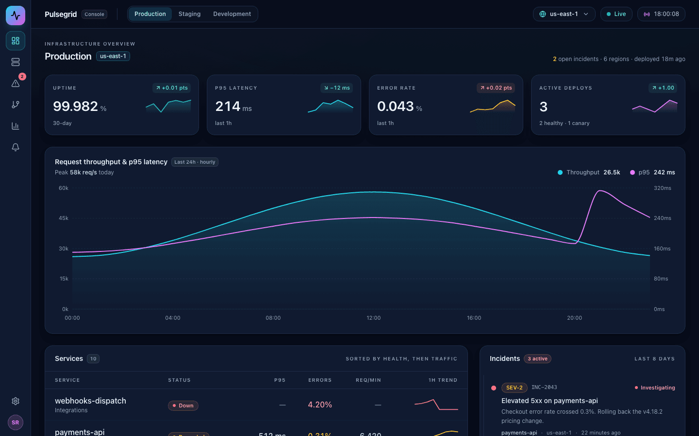
Dark-mode infrastructure monitoring console with an environment switcher, an incident feed, and a service health grid.
Who it is for
Engineering teams who need a service health console without a monitoring contract.
What it does
- Watch service health
- Track incidents and alerts
- Review latency and error rates
Common in
The brief we build from
This is the exact instruction PromptUI starts with. You can change every word of it before or after the first build.
Build Pulsegrid, the internal monitoring console for our fictional cloud backend platform — a dense, dark, single-page infrastructure dashboard for the on-call engineer, not a marketing page. Commit fully to a dark theme done right: a deep navy ground (never pure black), cyan as the one accent with magenta reserved for a secondary data series, and every bit of text kept high-contrast and light — nothing darker than slate-400 on the navy. Use tabular numerals everywhere numbers line up.

Down the left edge put a compact icon rail (overview, services, incidents, deploys, metrics, alerts, settings) with a brand mark up top and an avatar at the bottom. Across the top, a bar with the product name, an environment switcher (Production / Staging / Development) that swaps all the data, a serving-region dropdown, and a live/paused toggle with a ticking clock.

The body leads with a KPI strip of four cards — uptime, p95 latency, error rate, and active deploys — each showing the value, a delta versus the previous window (green when it improved, red when it got worse), and a little sparkline. Under that, one hero time-series chart with recharts showing request throughput as a filled cyan area against p95 latency as a magenta line over the last 24 hours, on dual axes with a custom tooltip; make sure the axis ticks and labels are readable on the dark ground. Below the chart, split into a wide services table and a narrower incidents panel: the table lists services with status chips (operational, degraded, down, maintenance), p95, error rate, requests per minute, and a 1-hour trend sparkline; the incidents panel is a severity-coded timeline (SEV-1/2/3, investigating → identified → monitoring → resolved) with relative timestamps and a clean "all clear" empty state for environments with nothing on fire. Finish with a slim status bar summarizing how many services are healthy, the region, the release tag, and the last deploy. Fill it with believable infrastructure data — plausible service names, five-nines-ish uptime, sub-300ms latencies, tiny error rates, traffic in thousands of requests per second, and a varied incident history.
Other business templates
SaaS Dashboard
Admin dashboard with sidebar, metric cards, a data table, and dark-mode toggle.
Admin Panel
Full CRUD admin panel with users table, search, and modals.
Analytics Dashboard
Data analytics dashboard with charts, filters, and data tables.
Settings Page
User settings page with profile, notifications, billing, and security tabs.
Start from this template
PromptUI builds it, checks that it actually runs, and helps you put it online. Free to start.
Build this